Creating Forms
Creating Forms: Step-by-Step Guide
This guide walks you through creating, configuring, and publishing a form in BuoyForms.
Creating a New Form
-
1
Open the Forms page
Go to Forms in the sidebar and click + New Form in the top-right corner.
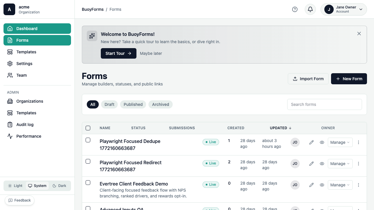
The Forms page with the + New Form button highlighted -
2
Choose a starting point
Pick how you want to start:
Start from scratch with a blank canvas. Best when you have a specific layout in mind.
Describe your form in plain English and let AI build it. For example:
Create a customer feedback survey with NPS score,
a follow-up question for detractors, and email field
AI generates the complete form in seconds — you can edit everything afterward.
Browse community templates by category (feedback, registration, intake, etc.) and click Use Template to create a copy you can customize.
::step{title="Name your form"} Enter a title for your form (e.g., "Customer Feedback Survey") and click Create. You'll land in the form builder ready to edit.
The Form Builder
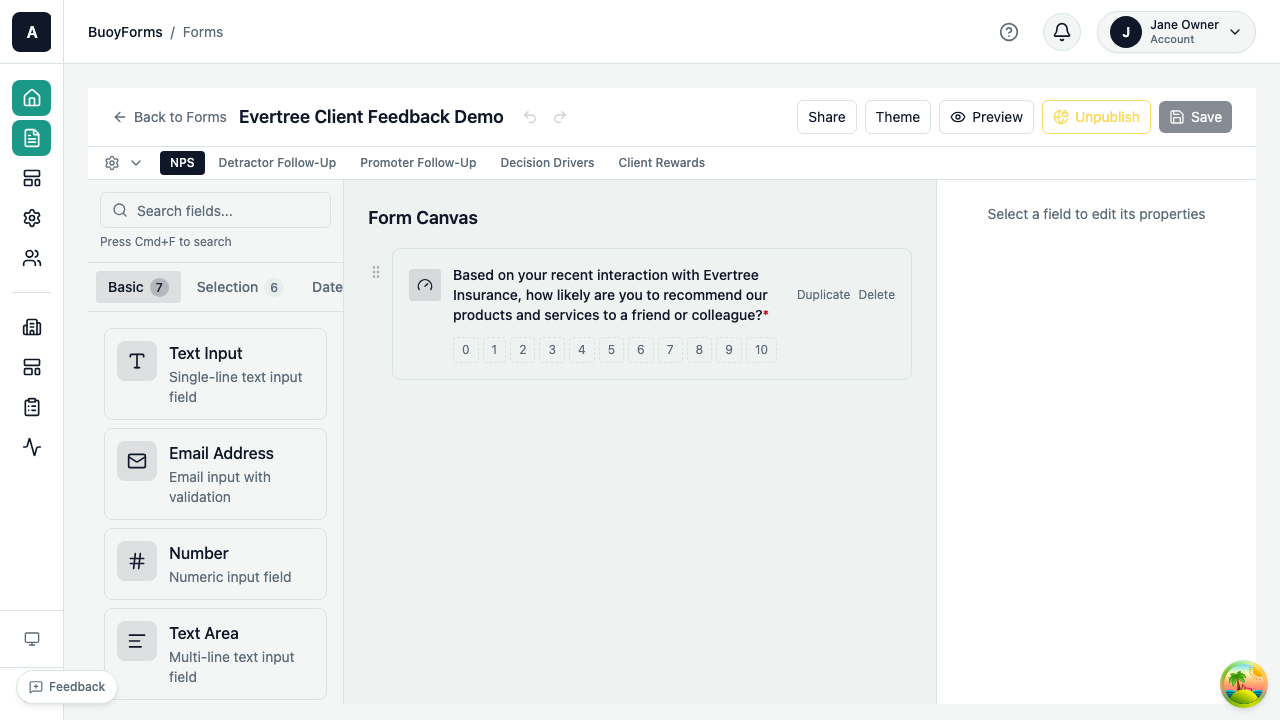
The builder has four main areas:
| Area | Location | Purpose |
|---|---|---|
| Field Palette | Left | Drag fields onto your form — 29 field types organized by category |
| Form Canvas | Center | Preview and arrange your fields in real-time |
| Field Properties | Right | Configure the selected field's label, options, validation, and logic |
| Top Bar | Top | Pages, Settings, Translations, Preview, and Publish |
Adding Fields
-
1
Find the field type
Browse or search the field palette on the left. Fields are organized into categories: Basic, Selection, Rating, Advanced, Date/Time, File, and Layout.
-
2
Add it to the canvas
Click a field type to add it at the end, or drag it to a specific position on the canvas.
-
3
Configure the field
The field appears on the canvas and its properties panel opens on the right. Set the label, placeholder, description, and validation rules.
Configuring Fields
Click any field on the canvas to select it. The Field Properties panel shows:
Basic Settings
- Label — the question text respondents see
- Placeholder — hint text inside the input
- Description — help text below the field
- Required — whether the field must be filled out
Type-Specific Settings
- Options (for radio, checkbox, select)
- Scale range and labels (for NPS, CSAT, CES, scale)
- File limits (for file upload)
- Layout options (vertical, horizontal, card grid)
Advanced: Conditional logic and pre-fill
Each field also supports advanced configuration:
- Conditional Logic — show or hide this field based on answers to other fields. See the Conditional Logic guide.
- Pre-fill Parameter — auto-fill the field's value from a URL query parameter. Useful for personalized links (e.g.,
?email=user@example.com).
Reordering, Duplicating, and Deleting
- Drag and drop fields on the canvas to reorder them
- Hover over a field to see Duplicate and Delete buttons
- Duplicate creates a copy with the same configuration
Multi-Page Forms
Break long forms into manageable steps with pages. Multi-page forms show a progress indicator and Next / Back buttons.
-
1
Open the settings bar
Click the Pages, Settings & Translations bar at the top of the builder.
-
2
Add a page
Click + Add Page. Name the page by clicking the edit icon next to the page title.
-
3
Assign fields to pages
Drag fields between pages, or add new fields directly to the active page. Click any page tab to switch between them.
Page Settings
Each page has:
- Page Title — the heading respondents see at the top of the page
- Conditional Logic — show or hide the entire page based on previous answers (e.g., skip a page if a certain option was selected)
Form Settings
Expand the Pages, Settings & Translations bar to access these settings:
Flow Mode
Traditional form layout with all fields visible on each page. Respondents scroll through fields and submit at the end. Best for short forms and data collection.
One question at a time, full-screen presentation (like Typeform). Respondents advance through fields with Enter or a Next button. Best for surveys and conversational forms.
Button Labels
Customize the text on navigation buttons:
- Next Button Label — default: "Next"
- Submit Button Label — default: "Submit"
Thank-You Pages
Configure what respondents see after submitting:
- Custom message — a thank-you message with optional description
- Redirect — send respondents to a URL after submission
- Multiple exit pages — route respondents to different thank-you pages based on their answers (e.g., different messages for promoters vs. detractors in an NPS survey)
Translations
BuoyForms supports multi-language forms for international audiences.
-
1
Add a language
In the Translations panel, click Add Language and select the language from the dropdown.
-
2
Translate content
Translate field labels, descriptions, placeholder text, and button labels for each language.
-
3
Publish
Respondents see a language selector when filling out the form. The form automatically displays in their selected language.
Advanced: Import/Export translations
For large forms or professional translation services:
- Export — download all translatable strings as JSON
- Import — upload translated JSON to apply translations in bulk
This is useful when working with external translators who prefer to work in their own tools.
Saving and Publishing
Auto-Save
The builder auto-saves your changes as you work. You'll see "Saved just now" in the header — no need to manually save.
Publishing
-
1
Preview first
Click Preview to see your form exactly as respondents will see it — without making it public.
-
2
Publish
Click Publish in the top-right corner. Your form is now live and accepting submissions.
-
3
Share
Click Share to get your form's direct link, embed code, or QR code. See Distributing Forms for all sharing options.